CoolWorks
Logo & Identity
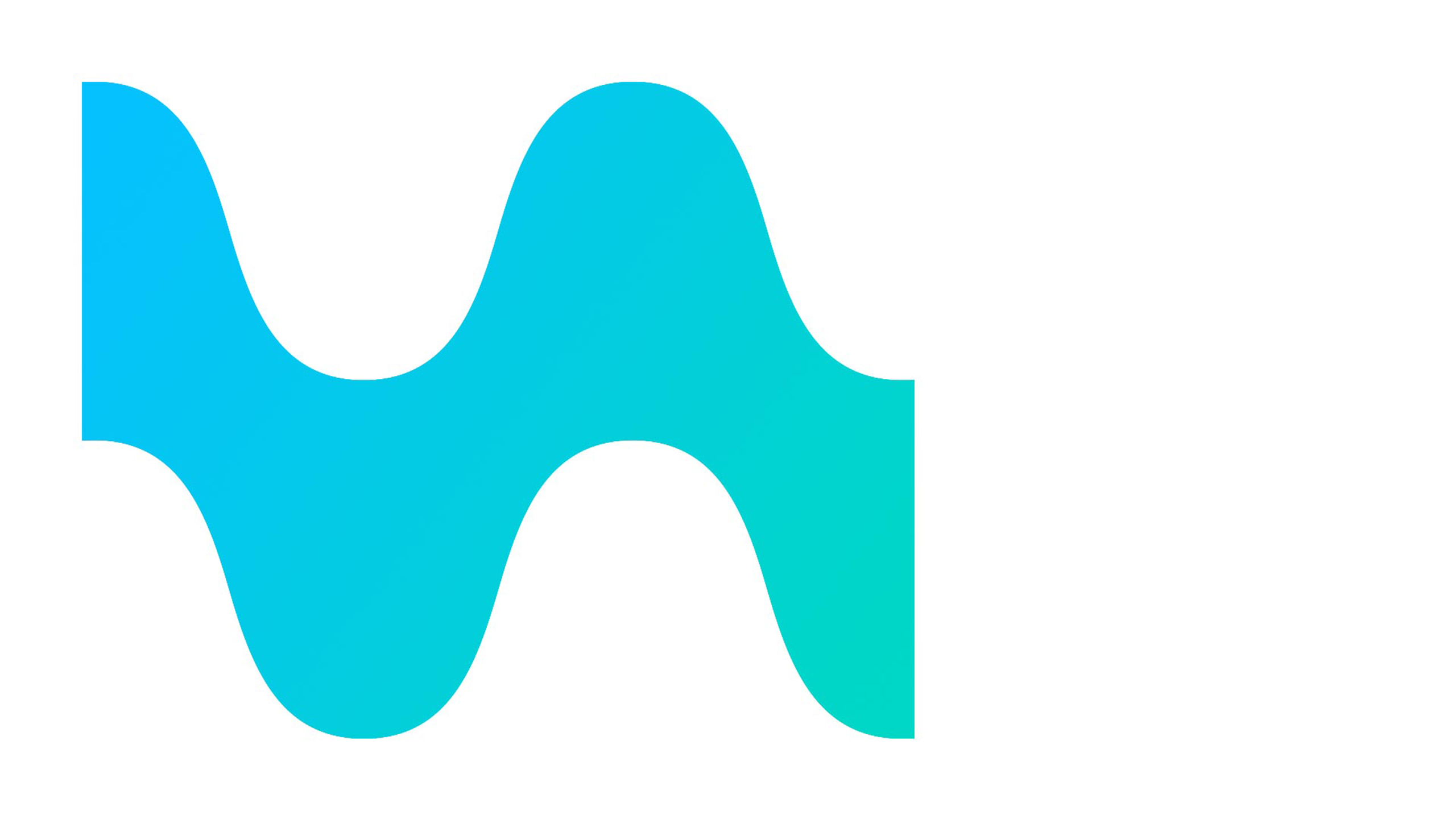
The predominant colour in the visible spectrum is blue.
Second, our eyes detect green.
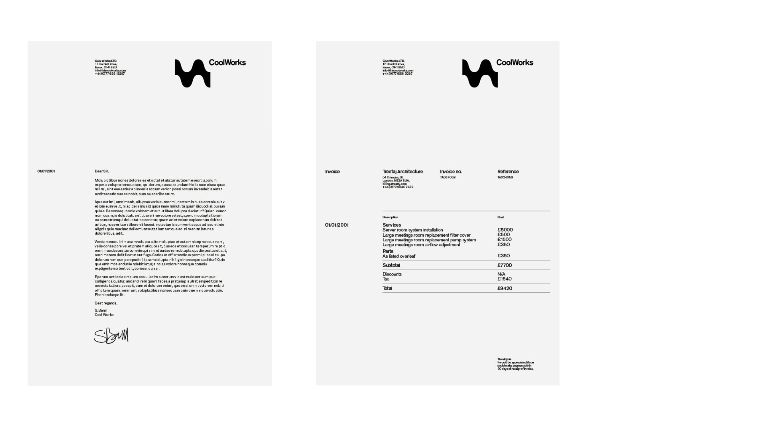
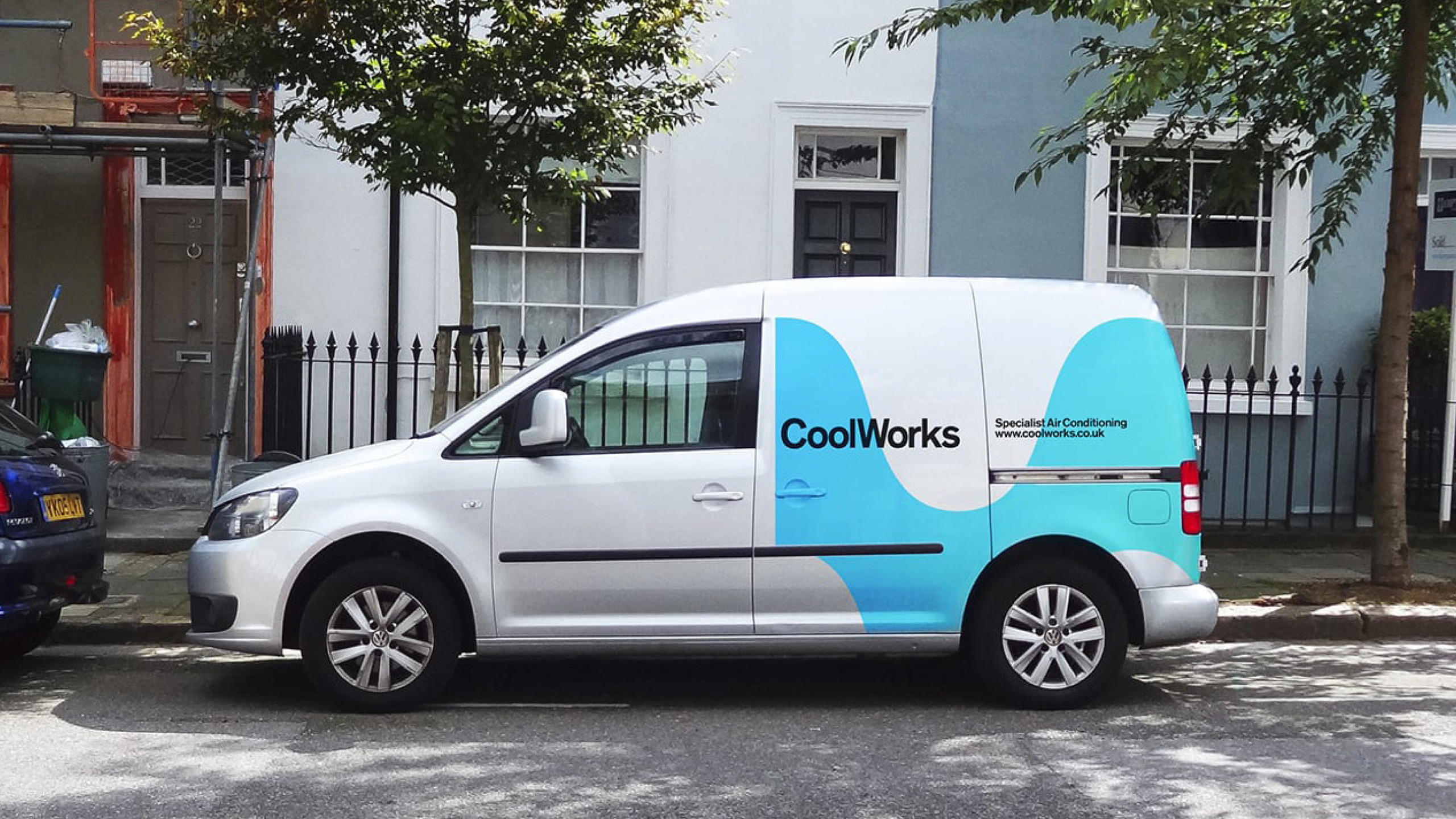
CoolWorks are a specialised company based in the South East of England, focusing on air conditioning and refrigeration services.
As a burgeoning start-up aiming to establish a strong presence in the region, founder Shaun Bann sought a distinctive and memorable identity that would set them apart from other industry operators.
To visually represent the essence of their expertise, a waveform motif was chosen, symbolising the movement of cool air through space. The identity has a clean and impactful aesthetic to give a lasting impression.