A warming brand identity and logo design for an independent sports massage practice.
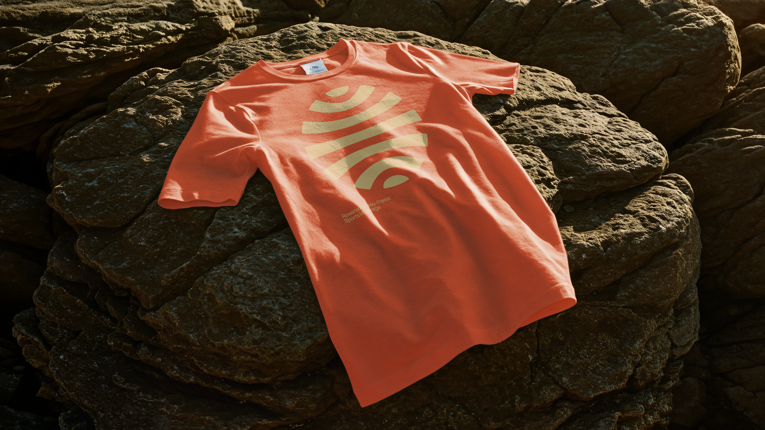
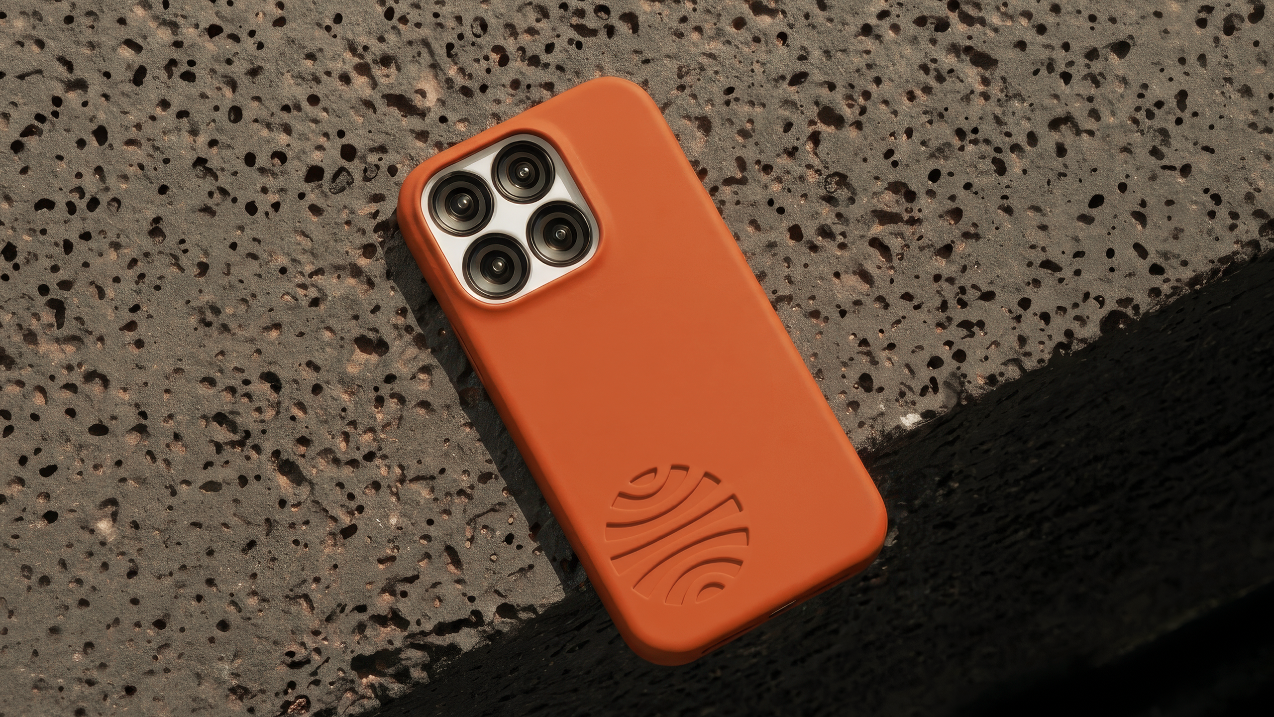
Rowena came to Relook looking for a new brand identity for her sports and remedial massage practice. She needed a professional, approachable identity that could work across business cards, clothing and promotional materials, with the potential for a wider rollout as the business develops.
The brief was to avoid the usual visual territory associated with sports and fitness brands. Rather than something overly masculine, clinical or spa-like, we opted for a warmer and more therapeutic direction that reflected the personal nature of Rowena’s work.
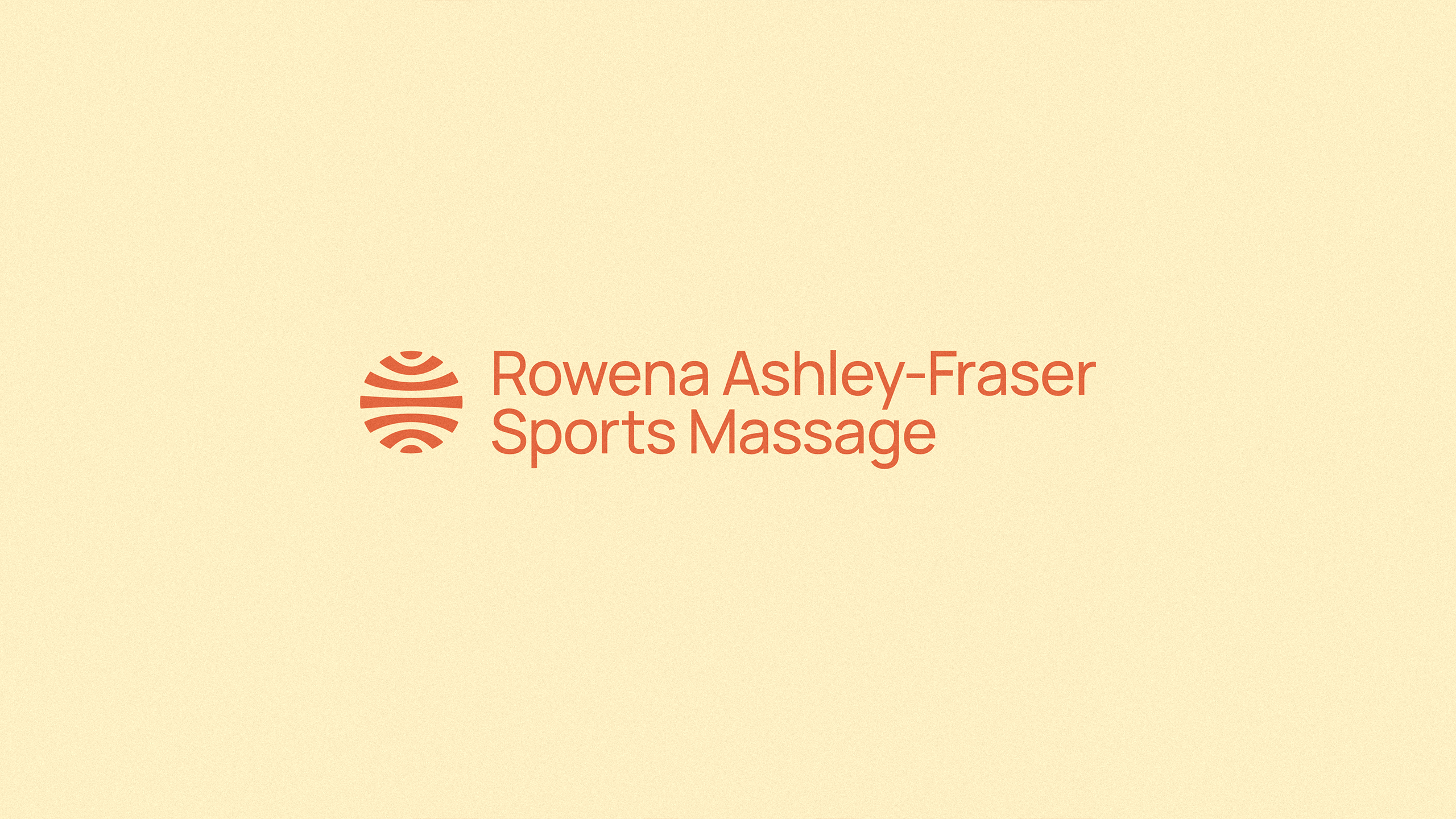
The resulting logo draws its inspiration from the human form, hands, movement and anatomy, creating a distinctive mark without being overly literal. A warm, energetic colour palette and bold typographic system give the identity personality while keeping it versatile enough to work across print and digital applications.
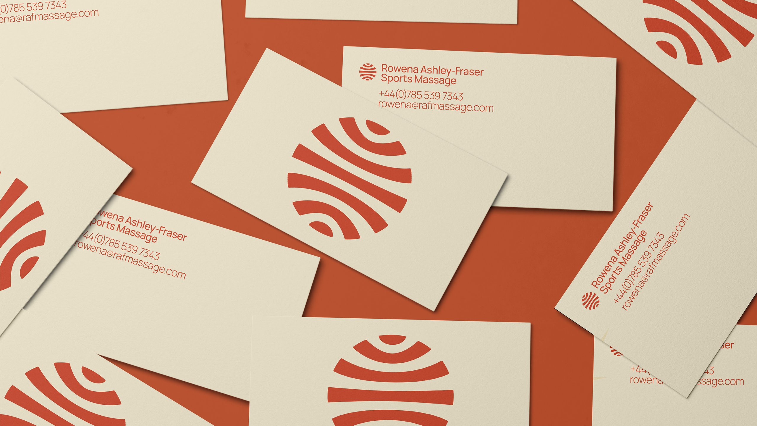
Alongside the core logo design, I created a set of brand assets including colour and typography, logo variations, social media icons and animations to provide stand-out. I also developed the initial business card design and a concise set of brand guidelines to help keep the identity consistent as the business grows.
The result is a considered, approachable visual identity for an independent sports massage practice, giving Rowena a professional foundation to build her business around.
Services: Brand identity · Logo design · Art direction · Print design · Brand guidelines